Fountain pens, inks, and papers
I recently had to print some forms at work, with the intention of filling out the details with my usual writing toy: one of my fountain pens. I quickly realised that I had a challenge on my hands; the paper that we normally use in the printer (both at home and at work, although that’s two different brands) work great in laser and inkjet printers, but not for a fountain pen.
Some experiments and some searching on the Internet revealed two problems:
- the paper I normally use for writing isn’t really suited for a printer
- there aren’t many places to find out whether a “normal” printer paper is suitable for a fountain pen
I did find this blog posting about exactly this topic – but it’s specific to two HP papers.
So, I had to find out for myself…
The setup
The test was to find out how a bunch of different papers that I have on-hand behave with a selection of inks and pens. So, I got the following ready:
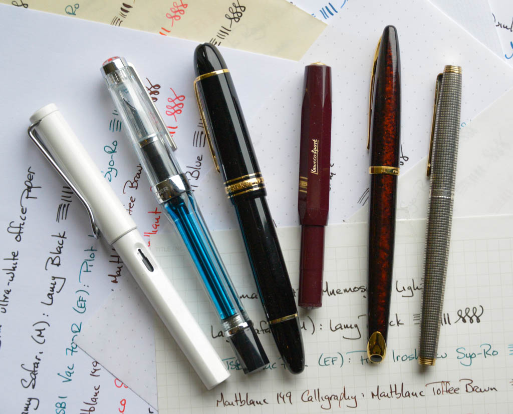
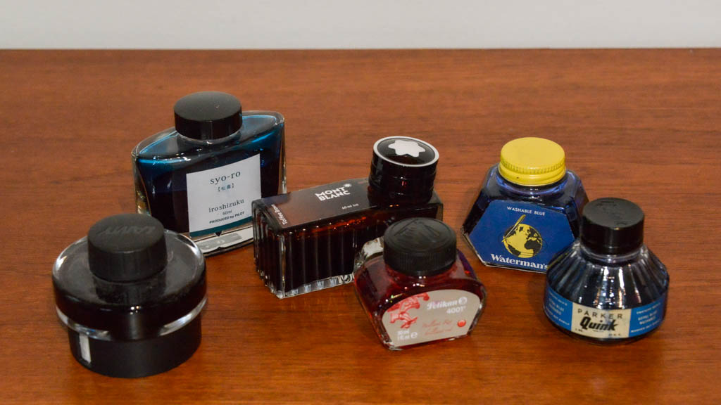
- Lamy Safari, medium nib. Lamy black ink (T10 cartridge)
- TWSBI Vac700R, extra-fine nib. Pilot Iroshizuku Syo-Ro ink
- Montblanc 149, flexible calligraphy nib. Montblanc Toffee Brown ink
- Kaweco Sport, fine nib. Pelikan 4001 Brilliant Red ink
- Parker 75, #66 (medium) nib. Vintage Parker Quink – Royal Blue Washable Ink (contains Solv-X)
- Waterman Carène, fine nib. Vintage Waterman’s Washable Blue Ink (Made in Canada)

I tried to be as consistent as possible writing on each of the paper samples. Each sheet was placed on the Rhodia pad while I was writing to keep the subsurface consistent. It should be said, however, that some of the pens are a little more sensitive than others to pressure variations. The Montblanc is particularly variable – but I’m still getting used to it…
On the right of each line, there are 4 horizontal lines: the top two are with a light pressure and the bottom two are with a higher pressure. Next are 4 vertical lines: the left two are with a light pressure and the right two are with as much as I’m willing to push the nibs.
The papers were the following:
- Rhodia Dotpad No. 18 (80 gsm)
- Maruman N172 Mnemosyne Light pad (80 gsm)
- Tomoe River: White (52 gsm)
- HP Color Laser (160 gsm)
- Conqueror Diamond White Laid (120 gsm)
- Papyrus Plano Universal (80 gsm)
- Pioneer Ultra-White Office Paper (100 gsm)
- Vintage unknown brand
The photos were taken by taping each sheet to a white backboard. The camera’s exposure and white balance was fixed so that any colour variations are represented in the photos. I set the exposure a little low in order to ensure that I didn’t blow-out the edges of the ink transition to white, which is why all of the photos look a little dark.
Rhodia Dotpad No 18: 80 gsm
The Rhodia Dotpad with Clairefontaine paper is first up, because it’s the ubiquitous for fountain pen reviews and demos. Unfortunately:
- you can’t buy this paper as a ream of standard A4 to run through a printer
- the Dotpad full sheet is A4, so after you tear off the sheet at the perforation it’s no longer a full-sized sheet
- Rhodia doesn’t make an A3 sized pad so you could “harvest” an A4 sheet from it
However, if someone knows which Clairefontaine paper to buy that would do the trick, please let me know…


As can be seen in the photos above (and at the bottom in the close-ups):
- There’s very-little-to-no feathering. In fact, the only time I’ve had problems with feathering with Rhodia pads is with a very scratchy or extremely fine nib (like a dip pen or a Japanese extra fine)
- There’s almost no bleeding / ghosting so it’s easily possible to use both sides of the paper.
The Rhodia paper is not the smoothest of the papers in this list – so there’s a little feedback from the nibs, but, personally, I prefer this to the really smooth papers
Maruman N172 Mnemosyne Light: 80 gsm
The Maruman Mnemosyne notebooks are my personal favourite (although I use a Stálogy Editor’s Series 365Days B5 Notebook at work). The paper is smooth, but not glossy, and slightly thicker than the Tomoe River 52 gsm paper. It takes the ink, so there’s nice saturation of the colours


- There’s absolutely no feathering at all, and the flex nibs are able to pull back to a fine line after being pushed.
- There’s no bleeding and very little ghosting so it’s easily possible to use both sides of the paper.
If I could buy this paper as a ream in A4, it’s all I would use… But it seems (at least in Denmark) to be only available in notebook form.
Tomoe River: 52 gsm (White)
Tomoe River is another “go-to” paper for fountain pen people. When you first use it, there are two surprising things: it’s thin, and it’s smooth! On the plus side, you can buy this in sheets (I bought mine as A3 sheets here, for binding my own notebook).


- Again, there’s absolutely no feathering
- Despite the thinness of the paper, there’s no bleeding and little ghosting. You can see a little on the very thick (and therefore wet) lines laid down by the Montblanc; but that’s an extreme case.
Although Tomoe River paper can be bought in sheet-form, it’s too thin to behave when sent through a printer. Typically, when I try to do this, I get about a 66% success rate. For every 3 sheets that I try to print, 2 sheets come out of the printer, and I have to open up the drawers and doors to clear the paper jam caused by the third. One trick that works on some printers is to intersperse each sheet with a sheet of “normal” paper. However, in my opinion, both of these options are too wasteful to be feasible.
So, it’s a nice paper to write on, but useless as printer paper.
As I’ll mention below, one of the interesting aspects of this paper is that the saturation of the ink is lower than with most of the other papers. More on this later.
HP Color Laser: 160 gsm
This HP paper is thick and heavy: more than 3 times the Tomoe River paper… However, it does behave very nicely when run through a printer (since that’s ostensibly what it’s for, as you can see in the name).
This is a very smooth paper that takes the ink well, resulting in a good saturation of the colours. It’s works well with most fountain pens and inks, with some caveats mentioned below.


- There’s no feathering most of the time with most of the pens and most of the inks. However, if you take a look at the thicker lines made with the Montblanc, you can see that, when a lot of ink is laid down, things get a little messy.
- For “normal” usage, there’s no bleeding or ghosting. However, you can see on the left-hand side of the photo that the Montblanc ink bleeds through the paper when the nib is flexed,.
So, for day-to-day use, this paper is good both in a printer and for writing with a fountain pen. However, I would not recommend it for practicing calligraphy with a flex nib – not unless you keep busy with a blotter.
Conqueror Diamond White Laid: 120 gsm
The “Laid” part in the name of this paper refers to the fact that the pulp is laid down on the screen, resulting in vertical lines in the paper that are not smoothed out when it’s finished. This varying paper thickness gives the paper a more “hand-made” appearance. I’ve read that these lines help as a reference when writing; however, this doesn’t make sense to me, since they’re vertical on the A4 sheet.
Again, this is a pretty heavy paper – 120 gsm – not as heavy as the HP that I tested, but still not your average printer paper.

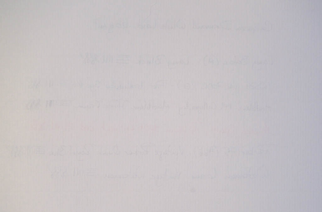
- In spite of the texture on the paper’s surface, there’s very little feathering. Flex nibs do not have a problem snapping back to a thin line.
- There’s no bleeding, and very little ghosting, which is not surprising, given the weight of the paper.
One complaint I have with this paper is the texture. It’s very nice in the hand when you’re done; but the lines in the paper are easily noticeable when writing, and can sometimes actually interfere with tighter curves. Although I didn’t try any cursive writing or calligraphy for this test, I already have a strong suspicion that this paper would drive me nuts if I tried it for this.
Papyrus Plano Universal: 80 gsm
This is the paper that we buy at our local supermarket for stocking the inkjet printer at home. It’s cheap, and available everywhere near where I live.


- Although this paper is fine in our ink-jet, this is not a paper that is made for fountain pens. There’s significant feathering, bleeding, and ghosting.
Pioneer Ultra-White Office Paper: 100 gsm
The Pioneer 100 gsm paper is also a “standard” printer paper that is easily available in office supply stores. It’s neither as thick nor as smooth as the HP paper, however, it works very well with all of the pens and inks tested, as long as you’re not planning on writing on both sides of the paper.
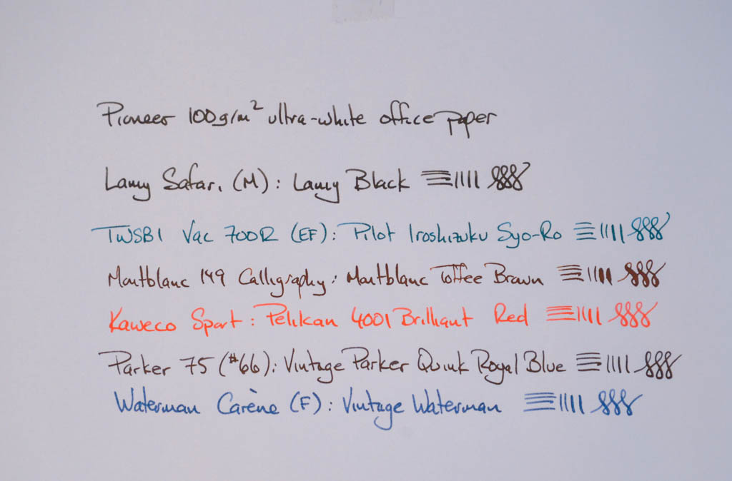
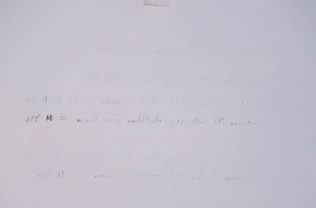
- there’s no noticeable feathering to speak of, however, the fine lines of the Montblanc and the TWISBI, for example, are thicker than those on (for example) the Rhodia paper.
- there are some problems with bleeding and ghosting; especially with the Pilot, Montblanc, and Waterman inks.
Vintage unknown brand
This paper was in a box that I found at a local antique store. It’s a creamy colour, and it’s a strange size, and it has some really interesting characteristics – so I thought that I’d throw it in the test while I was at it, just for fun.
This is not a smooth paper. It also has some discolouration in spots (when I found it, it was hiding in a drawer of an old cabinet in an unheated barn… so it might just be a bit moldy… Not too bad, though…)


- There’s absolutely no feathering with any of the inks. However, like the Tomoe River paper, it’s almost as though the ink doesn’t really soak into the paper, so the saturation is low compared with the other papers. This can be seen in the matrix photo below.
- There’s no bleeding, however, there is some noticeable ghosting with all of the inks, as can be seen above. However, it certainly isn’t bad enough to obviate using both sides of the paper.
Personally, I love this paper… My current plan is to make a fountain pen journal with it. I only wish I knew where it comes from, and how old it is…
The Matrix
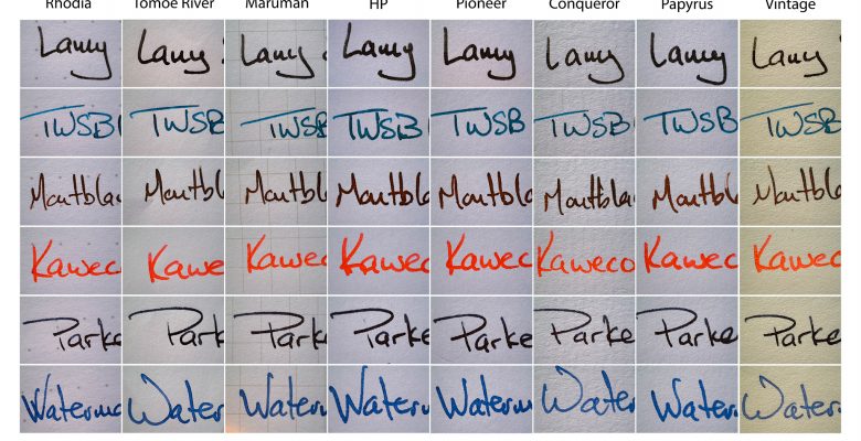
I took a vertical slice of each of the photos above to do a direct comparison of the papers, which is shown below. I would recommend right-clicking on the photo and either downloading it or viewing in a separate window or tab to see it in full size.
There are some things to notice:
- The Tomoe River, the “Vintage”, and the Conqueror papers have a lower saturation than the other papers. Notice, for example, that the “Lamy” is more gray than black, and the Waterman ink is a little lighter blue. If you zoom in, you’ll see “holes” in the lines where the ink did not penetrate the paper. Interestingly, it also results in the Pilot ink separating slightly, resulting in a colour variation at the edges of some of the lines.
- The feathering on the Papyrus paper is evident. It’s so bad that it confuses the JPG encoding.
- The Rhodia, Tomoe River, Maruman, and Vintage papers deliver the finest lines. (Sadly, none of these are “printer-friendly”.)
- The most consistent ink across all of the papers was the Pelikan 4001 Brilliant Red (I’m not the first person to notice this. That’s why I included it in the test.)

The conclusion
In the end, I wound up choosing the HP paper for the forms that I was printing. It was the best choice, not only due to the smoothness, but also the thickness. When I fill out the information on the form, I’m using the TWSBI pen with the same Pilot ink I used for this test.
I’ll stick with Maruman and Rhodia for my notebooks, however, the Pioneer turns out to be a good, inexpensive option for doing things like practicing my calligraphy and flourishing (which is how I’m spending my free time over the Christmas holiday…)

Update: 2023
A friend of mine loaned me his Dino-Lite USB microscope, so I decided to re-visit this little experiment. It’s now March, 2023, more than 2 years after I put pen to paper for this little investigation, and I put each ink and paper combination under the microscope to see how things were doing. All papers were kept for the past two years in a drawer of a filing cabinet. So there’s been no fading due to exposure to light. The Dino-Lite does some white balance compensation, so I wouldn’t rely on doing a direct before/after comparison.’


